Understanding the Norman Door
10.17.2022
One should never stumble away from a door feeling bruised, battered, and defeated.
Have you ever struggled to operate a simple, ordinary object? A door, perhaps? Doors have the power to cause shame, embarrassment, and physical injury. I experienced all three when I yanked on a door handle at work and almost dislocated a shoulder!

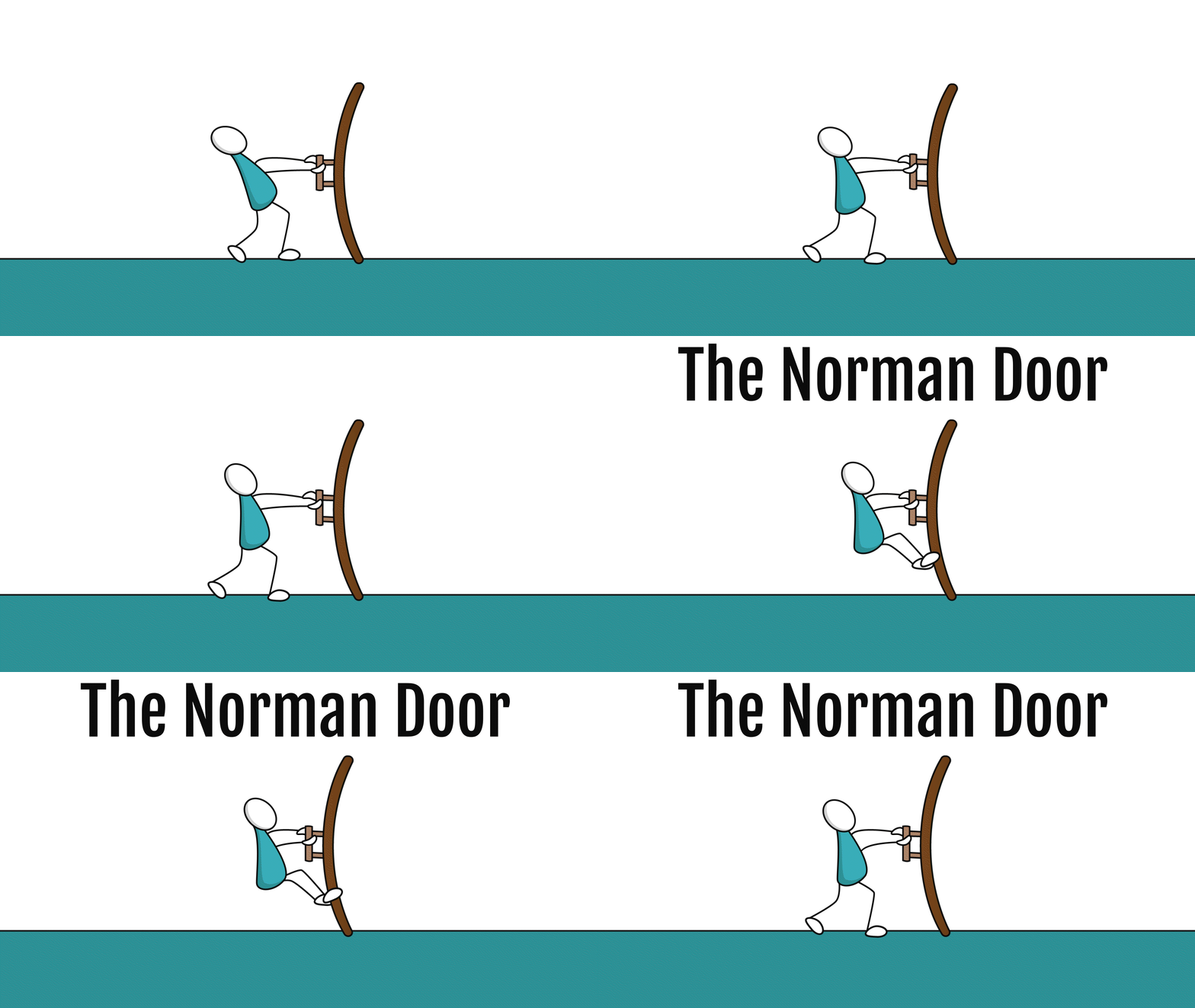
While many door-related injuries are freak accidents or the result of malfunctioning parts, some result from poor design. In my case, I mismanaged the operation of a "push" door outfitted with "pull" handles.
Doors that do not behave as advertised are called Norman Doors, named in honor of Don Norman, who first described the phenomenon in his influential book, The Design of Everyday Things.
Using something incorrectly or not being able to use it at all is often referred to as a user error. But is it the fault of the user? Is it their error?
How does a Norman Door happen?
 How can something as familiar as a door be poorly designed? Simple. A Norman Door is not designed with functionality in mind.
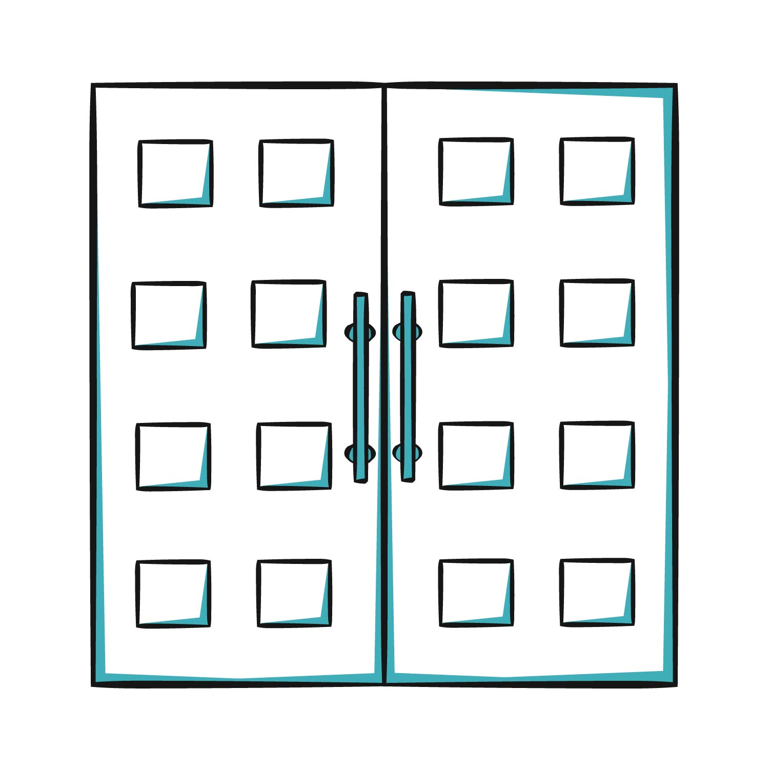
Sure, my door opened and closed. But it did not effectively communicate how I could trigger this action. The vertical handles indicated that the door should be pulled, not pushed. The door sat flush with the wall, hiding all operational hardware. This design made the imposing paneled doors sleeker aesthetically, but it removed additional cues that might help me understand which way to open the door. The focus of this design was not on communicating functionality but on visual style. I realized I should push this door only after tearing my rotator cuff.
One should never stumble away from a door feeling bruised, battered, and defeated. So, how can designers ensure that people have successful interactions with objects? They can begin by designing for the people.
Design Thinking and Human-Centered Design
Design thinking, a humanist approach to innovation that places the person or user at the center of the design formula, is the product of collaboration between experts in various fields, including psychology, industrial design, the arts, and engineering. The framework applies the problem-solving methodologies of human-centered design (HCD). In theory, HCD strives for four results:
- People's needs are met.
- The product is understandable and usable.
- The product accomplishes the desired tasks.
- The experience of using the product is positive and enjoyable.
In practice, HCD is an iterative process comprised of three phases: inspiration, ideation, and implementation.
Don Norman stresses that remaining true to the principles of HCD is the designer’s most significant obligation. In this video, he explains why it is crucial to always keep people and the right problem at the forefront of the design process.
Using design thinking and HCD to identify problems and solutions is only part of the battle. A design is only as good as its ability to function. Not only must the elements of a good design be methodically executed, but they must effectively communicate functionality. How is this possible? According to Don Norman, if the design is going to meet human needs, it must observe several fundamental design principles.
...I did receive feedback upon trying to open the door. A burning pain shot down my arm, signaling, unmistakably, that I had gotten it wrong!
The Fundamental Principles of Design
Discoverability
It is possible to determine what actions are possible and the current state of the device.
Discoverability is made possible, in part, by the principles of affordance, signifiers, and feedback.
Affordance
The proper affordances exist to make the desired actions possible.
With little conscious effort, a user assesses an object and creates a relationship with it. "Relationship” in this sense means understanding how to behave in relation to the thing based on its qualities. "The chair affords sitting." "The hairbrush affords brushing."
Signifiers
Effective use of signifiers ensures discoverability and that the feedback is well communicated and intelligible.
Signifiers are clues that communicate a design's possible functions and affordances: some are straightforward, like signs or labels, while others are "perceived affordances," such as the shape or placement of a door handle.
Feedback
There is full and continuous information about the results of actions and the current state of the product or service. After an action is executed, it is easy to determine the new state.
Norman defines feedback as "communicating the results of an action.” Without feedback, a user is left feeling uncertain about the status of an object or machine. Feedback can be an engine indicator light on a car’s dashboard or the ring of a cell phone signaling an incoming call.
(The Design of Everyday Things)
The relationship between these principles can be understood with the following equation, the sum of which is good design:
Affordance + Signifiers + Feedback = Discoverability
Discoverability → Understanding
Discoverability + Understanding = Good Design
The Norman Door – an Open and Shut Case
Now that we know Norman’s design principles, what can we determine about my Norman Door? Was it an example of good design?
Let’s (try to) open a Norman Door and perform a little analysis. Click Discoverability, Signifiers, and Affordances below to learn more.
Did the door provide Discoverability?
- From my experience with other doors, the long vertical door handles indicated they were meant to be pulled. But these did not budge when pulled!
- There were no other clues to help me understand how to operate the door. Parts like hinges, doorstops, and overhead door closers that might indicate the direction the door opened were either not visible or not part of the design. When functional hardware is not visible on your side of the door, it usually means you should pull the door. Yet more confusion!
- But I did receive feedback upon trying to open the door. A burning pain shot down my arm, an unmistakable signal that I had gotten it wrong!
What is the final analysis? I could not understand how to operate the door because it lacked discoverability. Bad design, all the way around.
Summary
Many people struggle to operate common, everyday objects. We tend to blame the user, even if it is ourselves, for misunderstanding how something works. When I could not open the door in my office building, I assumed it was my fault.
But a designer's role is to ensure the user can understand how to operate an object. A design should never alienate the very people for which it was created; in fact, it is the designer's responsibility to understand and empathize with their users.
Employing design thinking principles and human-centered design can shift the designer's focus to the user's needs to arrive at a product that works.

